
Reports are
summaries and analysis of your data, which you can display or print. A report returns a set of records that meets certain criteria, and
displays it in organized rows and columns. Report data can be filtered,
grouped, and displayed graphically as a chart.Reports are stored in
folders, which control who has access.
In Salesforce there are four types of reports :
1.
Tabular Report: Tabular reports are the simplest and fastest way to look at
data. Similar to a spreadsheet, they consist simply of an ordered set of fields
in columns, with each matching record listed in a row. Tabular reports are best
for creating lists of records or a list with a single grand total. They can’t
be used to create groups of data or charts, and can’t be used in dashboards
unless rows are limited. Examples include contact mailing lists and activity
reports.
2. Summary Report: Summary reports are similar to tabular reports, but also
allow users to group rows of data, view subtotals, and create charts. They can
be used as the source report for dashboard components. Use this type for a
report to show subtotals based on the value of a particular field or when you
want to create a hierarchical list, such as all opportunities for your team,
subtotaled by Stage and Owner. Summary reports with no groupings show as
tabular reports on the report run page.
3. Matrix Report: Matrix reports are similar to summary reports but allow you
to group and summarize data by both rows and columns. They can be used as the
source report for dashboard components. Use this type for comparing related
totals, especially if you have large amounts of data to summarize and you need
to compare values in several different fields, or you want to look at data by
date and by product, person, or geography. Matrix reports without at
least one row and one column grouping show as summary reports on the report run
page.
Creating Salesforce Report:
Creating Custom Report Types & Administrators with the “Manage Custom Report Types” permission can create and edit custom report types. To get started click Your Name > Setup > Create > Report Types. Salesforce Reports creation is very easy and we can reports in very less time.To create a new report:
- From the Reports tab, click New Report.
- Select the report type for the report, and click Create.
- Customize your report, then save or run it.
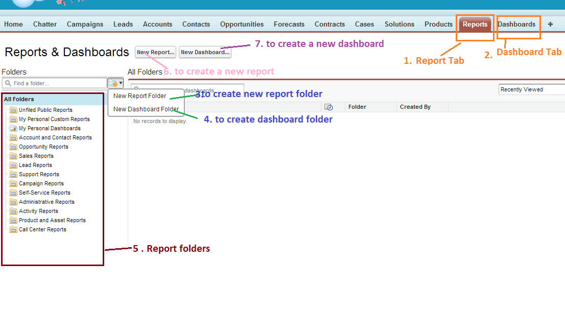
# Report tab is used to navigate reports screen. when you click reports tab it will display above screen.
# Dashboard folder is used navigate list of dashboard screen
# Create new report folder is used to create new report folder
# Create new dashboard folder is used to create new dashboard folder
# Left side box shows list of available report/dashboard folders in your org. By default salesforce will provide standard folders
# New report button is used to create new report and new dashboard button is used to create new dashboard.
To create new Salesforce Report follow below steps.
1. Click on report tab and then click in new report button. You will navigate to below screen

2. Select the report type ( which type of report you are creating ) and click on Create button. You will navigate to below screen.
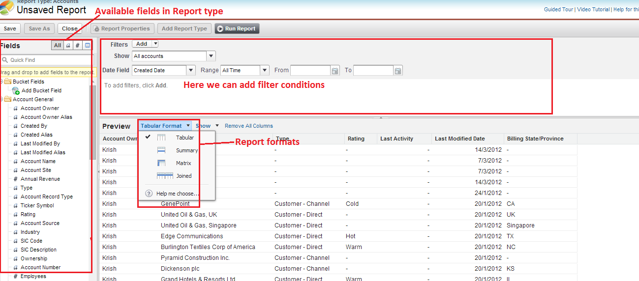
In the above image left side panel shows list of available fields in report type. We can easily add/remove fields to report by drag and drop from left side panel right (report preview) side panel. In salesforce we can create four types of reports. Those are Tabular, Summary, Matrix and Joined reports. We can add filters to our salesforce reports.
3. Click on Save your report once you done with your report customization(adding fields to report, selecting report format and adding filters to your report). Enter mandatory fields to save the report, those are Report name and also select the report folder.

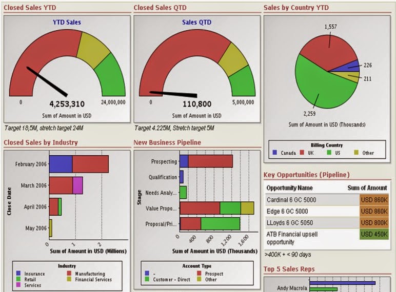
Dashboard is the graphical representation of
the data generated by a report or multiple reports. Dashboard component types can
be charts, tables, gauges, metrics, or other components that you can create
with Visualforce.
Different Kinds of Dashboard Component:
1.
Chart: Use a chart when you want to show data graphically.
2. Gauge: Use a gauge when you have a single value that you want to
show within a range of custom values.
3. Metric: Use a metric when you have one key value to display.
- Enter metric labels directly on components by clicking the empty text field next to the grand total.
- Metric components placed directly above and below each other in a dashboard column are displayed together as a single component.
4. Table: Use a table to show a set of report data in column form.
5.
Visualforce Page: Use a Visualforce page when you want to create a
custom component or show information not available in another component type.
6. Custom S-Control: Custom S-Controls can contain any type of content that you
can display or run in a browser, for example, a Java applet, an ActiveX
control, an Excel file, or a custom HTML Web form.


